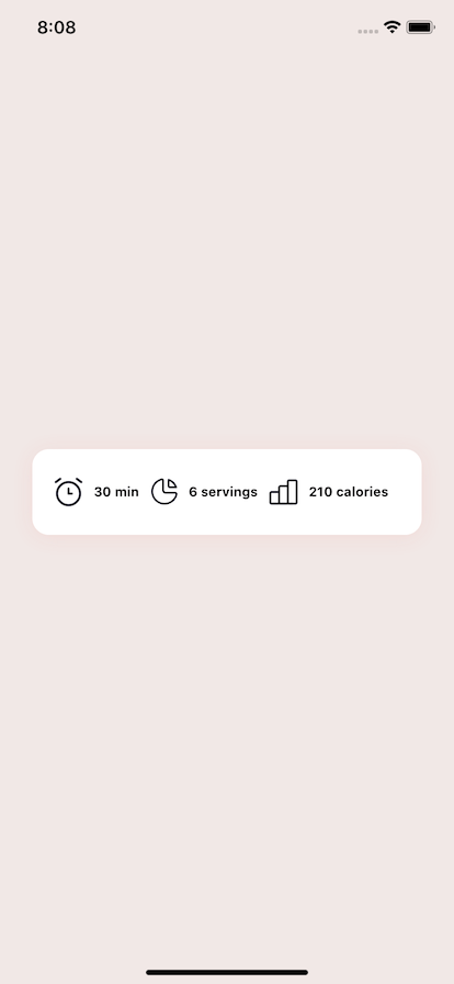
Build a Recipe Caloric Display

Setup
To find the referenced sketch file visit UIDesignDaily and download it. This will contain many different components you can build. We will focus on a component that displays caloric information as well as other information related to a recipe.
First we’ll need to install react-native-svg for so we can render our SVG icons. To install run expo install react-native-svg to get the correct version according to the expo version you have installed
Convert our Icons
To convert our SVG code visit Transform Tools which will take an SVG and convert it to React Native SVG code so we don’t have to do it manually.
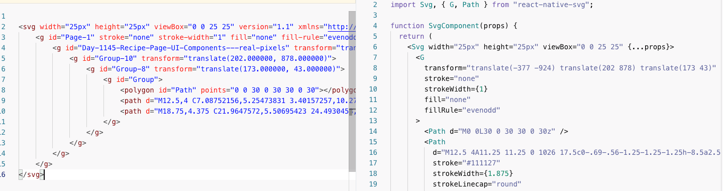
It will produce a rough output, and we’ll massage it. Create an icons.js file and we’ll hold all of our icons in it for our display bar.
import React from "react";
import Svg, { G, Path, Circle, Rect } from "react-native-svg";

export const Clock = (props) => {
  return (
    <Svg width="26px" height="28px" viewBox="0 0 26 28" {...props}>
      <G
        transform="translate(-247 -922) translate(202 878) translate(40 40)"
        stroke="none"
        strokeWidth={1}
        fill="none"
        fillRule="evenodd"
      >
        <Path d="M0 0L36 0 36 36 0 36z" />
        <Circle
          stroke="#111127"
          strokeWidth={2.25}
          strokeLinecap="round"
          strokeLinejoin="round"
          cx={18}
          cy={19.5}
          r={10.5}
        />
        <Path
          stroke="#111127"
          strokeWidth={2.25}
          strokeLinecap="round"
          strokeLinejoin="round"
          d="M18 15L18 19.5 21 19.5"
        />
        <Path
          d="M10.5 6L6.375 9M25.5 6l4.125 3"
          stroke="#111127"
          strokeWidth={2.25}
          strokeLinecap="round"
          strokeLinejoin="round"
        />
      </G>
    </Svg>
  );
};

export const Serving = (props) => {
  return (
    <Svg width="25px" height="25px" viewBox="0 0 25 25" {...props}>
      <G
        transform="translate(-377 -924) translate(202 878) translate(173 43)"
        stroke="none"
        strokeWidth={1}
        fill="none"
        fillRule="evenodd"
      >
        <Path d="M0 0L30 0 30 30 0 30z" />
        <Path
          d="M12.5 4A11.25 11.25 0 1026 17.5c0-.69-.56-1.25-1.25-1.25h-8.5a2.5 2.5 0 01-2.5-2.5V5a1.125 1.125 0 00-1.25-1"
          stroke="#111127"
          strokeWidth={1.875}
          strokeLinecap="round"
          strokeLinejoin="round"
        />
        <Path
          d="M18.75 4.375a11.25 11.25 0 016.875 6.875H20c-.69 0-1.25-.56-1.25-1.25V4.375"
          stroke="#111127"
          strokeWidth={1.875}
          strokeLinecap="round"
          strokeLinejoin="round"
        />
      </G>
    </Svg>
  );
};

export const Calories = (props) => {
  return (
    <Svg width="26px" height="24px" viewBox="0 0 26 24" {...props}>
      <G
        transform="translate(-531 -924) translate(202 878) translate(326 42)"
        stroke="none"
        strokeWidth={1}
        fill="none"
        fillRule="evenodd"
      >
        <Path d="M0 0L32 0 32 32 0 32z" />
        <Rect
          stroke="#111127"
          strokeWidth={2}
          strokeLinecap="round"
          strokeLinejoin="round"
          x={4}
          y={16}
          width={8}
          height={10.6666667}
          rx={1.33333333}
        />
        <Rect
          stroke="#111127"
          strokeWidth={2}
          strokeLinecap="round"
          strokeLinejoin="round"
          x={12}
          y={10.6666667}
          width={8}
          height={16}
          rx={1.33333333}
        />
        <Rect
          stroke="#111127"
          strokeWidth={2}
          strokeLinecap="round"
          strokeLinejoin="round"
          x={20}
          y={5.33333333}
          width={8}
          height={21.3333333}
          rx={1.33333333}
        />
        <Path
          d="M5.333 26.667H24"
          stroke="#202842"
          strokeWidth={2}
          strokeLinecap="round"
          strokeLinejoin="round"
        />
      </G>
    </Svg>
  );
};
Create our White Bar
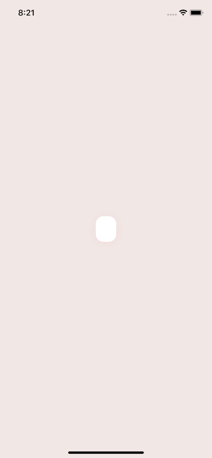
Now we’ll render our white bar container. The container will take up the whole screen and also center our general content. The spacer are each flex: 1 and will center the content without affecting the caloric display content.
export default function App() {
  return (
    <View style={styles.container}>
      <View style={styles.spacer} />
      <View style={styles.whiteWrap}></View>

      <View style={styles.spacer} />
    </View>
  );
}
Our styling for our container, and spacers.
const styles = StyleSheet.create({
  container: {
    flex: 1,
    backgroundColor: "#F1E8E6",
    paddingHorizontal: 10,
    alignItems: "center",
  },
  spacer: {
    flex: 1,
  },
});
Now lets pull apart our styling for our whiteWrap. We set our background color to white, and swap our content to display as flexDirection: ‘row’. Then we’ll set all of our content to be aligned in the center, and use the space-between setting to spread out our inner component pieces. One added benefit would be to potentially add flexWrap: ‘wrap' if you’re going to render more than 3 items.
Finally our shadow is made up of 4 pieces. shadowColor sets the color, the shadowOpacity sets the opacity. Finally our shadowRadius describes the spread of our shadow. The shadowOffset will move that shadow over on the X and Y even though it is labeled width and height. Here we have a 2 offset on y axis.
const styles = StyleSheet.create({
  container: {
    flex: 1,
    backgroundColor: "#F1E8E6",
    paddingHorizontal: 10,
    alignItems: "center",
  },
  spacer: {
    flex: 1,
  },
  whiteWrap: {
    backgroundColor: "#FFFFFF",
    shadowColor: "#F55951",
    shadowOffset: { width: 0, height: 2 },
    shadowOpacity: 0.1,
    shadowRadius: 10,
    borderRadius: 15,
    paddingHorizontal: 20,
    paddingVertical: 25,
    flexDirection: "row",
    alignItems: "center",
    justifyContent: "space-between",
  },
});
Create our Piece Component
Now we have our piece component. It will render each piece of data and will take an icon that is a React component, as well as children which will be some text. We want our icon and our text to be side by side. So we wrap it in a View and give it a flexDirection: ‘row’ and align in the center. The marginRight will make it so it can live next to others and have some spacing between other piece components.
Because we’re receiving a React component for our icon we can just drop it right in. Finally our Text will be bold, and apply a marginLeft so it is separated from the icon.
const Piece = ({ icon, children }) => {
  return (
    <View
      style={{
        flexDirection: "row",
        alignItems: "center",
        justifyContent: "center",
        marginRight: 10,
      }}
    >
      {icon}
      <Text
        style={{
          marginLeft: 10,
          fontWeight: "bold",
          fontSize: 12,
        }}
      >
        {children}
      </Text>
    </View>
  );
};
Render our Pieces
Now that we have a small piece component we can render our icons in the icon prop and pass our text in as children.
import React from "react";
import { StyleSheet, Text, View } from "react-native";
import { Calories, Serving, Clock } from "./icons";

export default function App() {
  return (
    <View style={styles.container}>
      <View style={styles.spacer} />
      <View style={styles.whiteWrap}>
        <Piece icon={<Clock />}>30 min</Piece>
        <Piece icon={<Serving />}>6 servings</Piece>
        <Piece icon={<Calories />}>210 calories</Piece>
      </View>

      <View style={styles.spacer} />
    </View>
  );
}
Final