Create an Animated Product Review Display with React Native

Introduction
Building reviews into an application is a common necessity for any developer. This is a design that can be added to both web and or native. I came upon UIDesignDaily which provides free designs including the Sketch/Figma and other design files. The reference for this tutorial can be found on UIDesignDaily
We'll build out these designs with React Native.
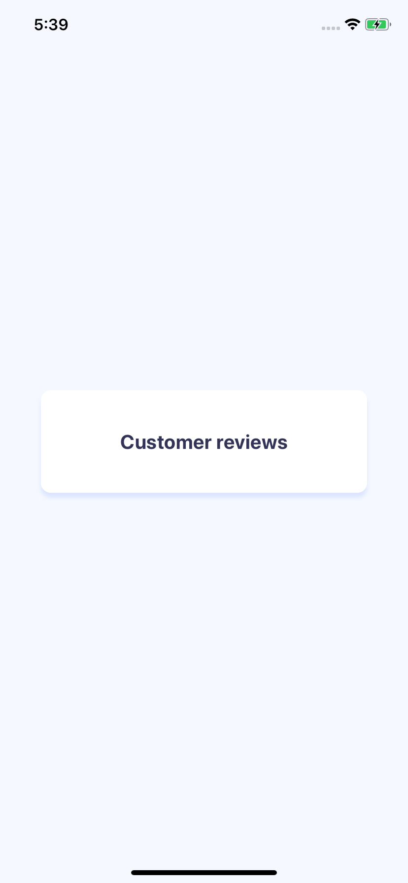
White Box with Title
We're first going to start with the base setup. This generally includes background, content container and the title.
So first off setting up the background we'll need a wrapping View along with styling.
{
    flex: 1,
    backgroundColor: "#F5F8FF",
    alignItems: "center",
    justifyContent: "center",
}
The styling sets color, and full height, and centers all of the content in the middle.
Our review container, will wrap all of the reviews. Because we're centering the whole content we'll need to set a minWidth. We'll set border radius, padding, and a shadow. The elevation we set will be for Android.
{
    backgroundColor: "#FFFFFF",
    borderRadius: 10,
    paddingHorizontal: 30,
    paddingVertical: 40,
    minWidth: "80%",
    shadowOffset: { width: 0, height: 5 },
    shadowOpacity: 1.0,
    shadowRadius: 2,
    shadowColor: "rgba(193, 211, 251, 0.5)",
    elevation: 5,
}
Then finally we'll setup our title. Putting all of the pieces together yields us with a centered white box with a shadow and our title. This will be the foundation for building out our component.
import React from "react";
import { StyleSheet, Text, View } from "react-native";

export default function App() {
  return (
    <View style={styles.container}>
      <View style={styles.reviewContainer}>
        <Text style={styles.title}>Customer reviews</Text>
      </View>
    </View>
  );
}

const styles = StyleSheet.create({
  container: {
    flex: 1,
    backgroundColor: "#F5F8FF",
    alignItems: "center",
    justifyContent: "center",
  },
  reviewContainer: {
    backgroundColor: "#FFFFFF",
    borderRadius: 10,
    paddingHorizontal: 30,
    paddingVertical: 40,
    minWidth: "80%",
    shadowOffset: { width: 0, height: 5 },
    shadowOpacity: 1.0,
    shadowRadius: 2,
    shadowColor: "rgba(193, 211, 251, 0.5)",
    elevation: 5,
  },
  title: {
    fontWeight: "bold",
    fontSize: 20,
    color: "#323357",
    textAlign: "center",
  },
});
Convert an SVG to React Native Code
We can copy our SVG from Figma and use Transform Tools to convert our SVG to React Native code. It will turn this
<svg
  width="33"
  height="30"
  viewBox="0 0 33 30"
  fill="none"
  xmlns="http://www.w3.org/2000/svg"
>
  <path
    d="M16.5 0L21.3489 9.82606L32.1924 11.4012L24.3457 19.0492L26.1985 29.8488L16.5 24.7494L6.80154 29.8488L8.65432 19.0492L0.807568 11.4012L11.6511 9.82606L16.5 0Z"
    fill="#FFCC48"
  />
</svg>
Into React Native code. I polished up a little to eventually look like this.
import React from "react";
import Svg, { Path } from "react-native-svg";

const Star = (props) => {
  return (
    <Svg width={24} height={22} viewBox="0 0 33 30" fill="none" {...props}>
      <Path
        d="M16.5 0l4.849 9.826 10.843 1.575-7.846 7.648 1.852 10.8-9.698-5.1-9.698 5.1 1.852-10.8-7.846-7.648L11.65 9.826 16.5 0z"
        fill="#FFCC48"
      />
    </Svg>
  );
};

export default Star;
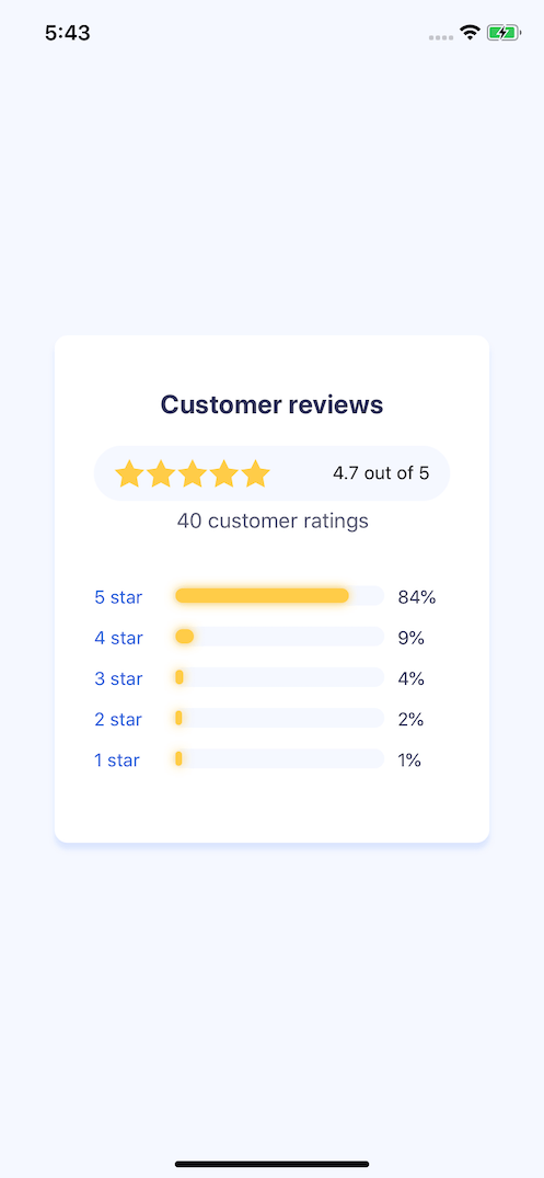
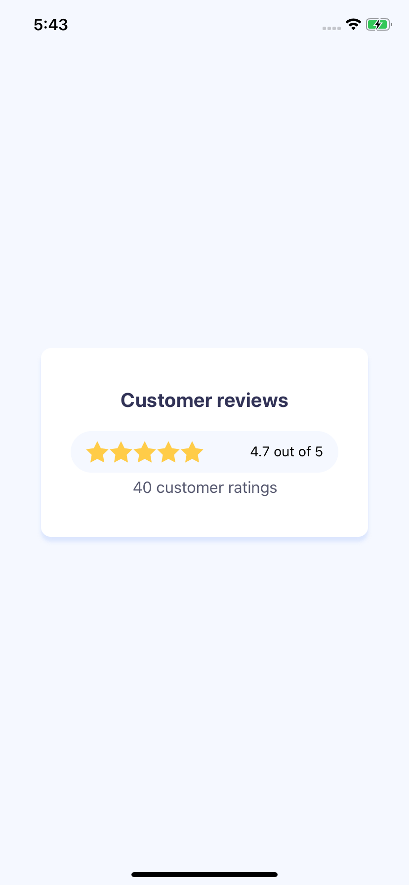
Sum of the Stars
Now that we have our star we can import it from our Star.js file import Star from "./Star";
We add a row to render 5 different stars. If it was real world the number of stars that would be displayed here would be dynamic.
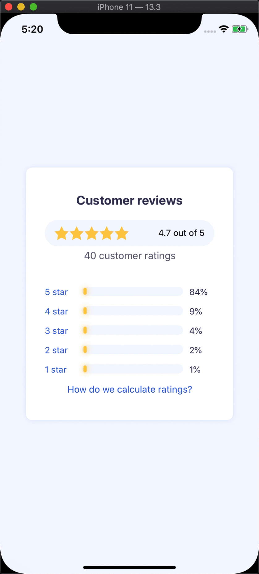
<View style={styles.container}>
  <View style={styles.reviewContainer}>
    <Text style={styles.title}>Customer reviews</Text>
    <View style={styles.totalWrap}>
      <View
        style={{
          flexDirection: "row",
        }}
      >
        <Star />
        <Star />
        <Star />
        <Star />
        <Star />
      </View>
      <Text>4.7 out of 5</Text>
    </View>
    <Text style={styles.amountText}>40 customer ratings</Text>
  </View>
</View>
Our total wrap is the total amount of stars, and our amount text is the amount of ratings we have. The totalWrap class adds a background color, and some padding to space the internal content from the sides. Then the space-between will space our text away from our grouping of stars.
{
  totalWrap: {
    marginTop: 20,
    marginBottom: 5,
    backgroundColor: "#F5F8FF",
    borderRadius: 40,
    alignItems: "center",
    justifyContent: "space-between",
    flexDirection: "row",
    paddingHorizontal: 15,
    paddingVertical: 10,
  },
  amountText: {
    fontSize: 16,
    color: "#595B71",
    textAlign: "center",
  },
}
Creating the Progress Bar
Each progress bar has the same structure. The first is the starText which will be a prop, then we can drive the display percentage, and the width of our percentage bar from a singular value.
const PercentageBar = ({ starText, percentage }) => {
  return (
    <View
      style={{
        flexDirection: "row",
      }}
    >
      <Text style={styles.progressText}>{starText}</Text>
      <View style={styles.progressMiddle}>
        <View style={styles.progressWrap}>
          <View
            style={[
              styles.progressBar,
              {
                width: `${percentage}%`,
              },
            ]}
          />
        </View>
      </View>
      <Text style={styles.progressPercentText}>{percentage}%</Text>
    </View>
  );
};
We display all of it as a row, and set our progressText and progressPercentText as specific width values. The reason we do this is that percentages like 1% will show at different lengths than 84%. Basically 2 characters instead of 3. So we can set widths that we know that our texts will fit, and everything will line up perfectly.
{
  progressText: {
    width: 50,
    fontSize: 14,
    color: "#2A5BDA",
  },
  progressPercentText: { width: 40, fontSize: 14, color: "#323357" },
  progressMiddle: {
    height: 15,
    flex: 1,
    marginHorizontal: 10,
  },
  progressWrap: {
    backgroundColor: "#F5F8FF",
    borderRadius: 18,
    position: "absolute",
    top: 0,
    left: 0,
    bottom: 0,
    right: 0,
    padding: 2,
  },
  progressBar: {
    flex: 1,
    shadowOffset: { width: 0, height: 0 },
    shadowColor: "#ffcc48",
    shadowOpacity: 1.0,
    shadowRadius: 4,
    backgroundColor: "#FFCC48",
    borderRadius: 18,
    minWidth: 5,
  },
}
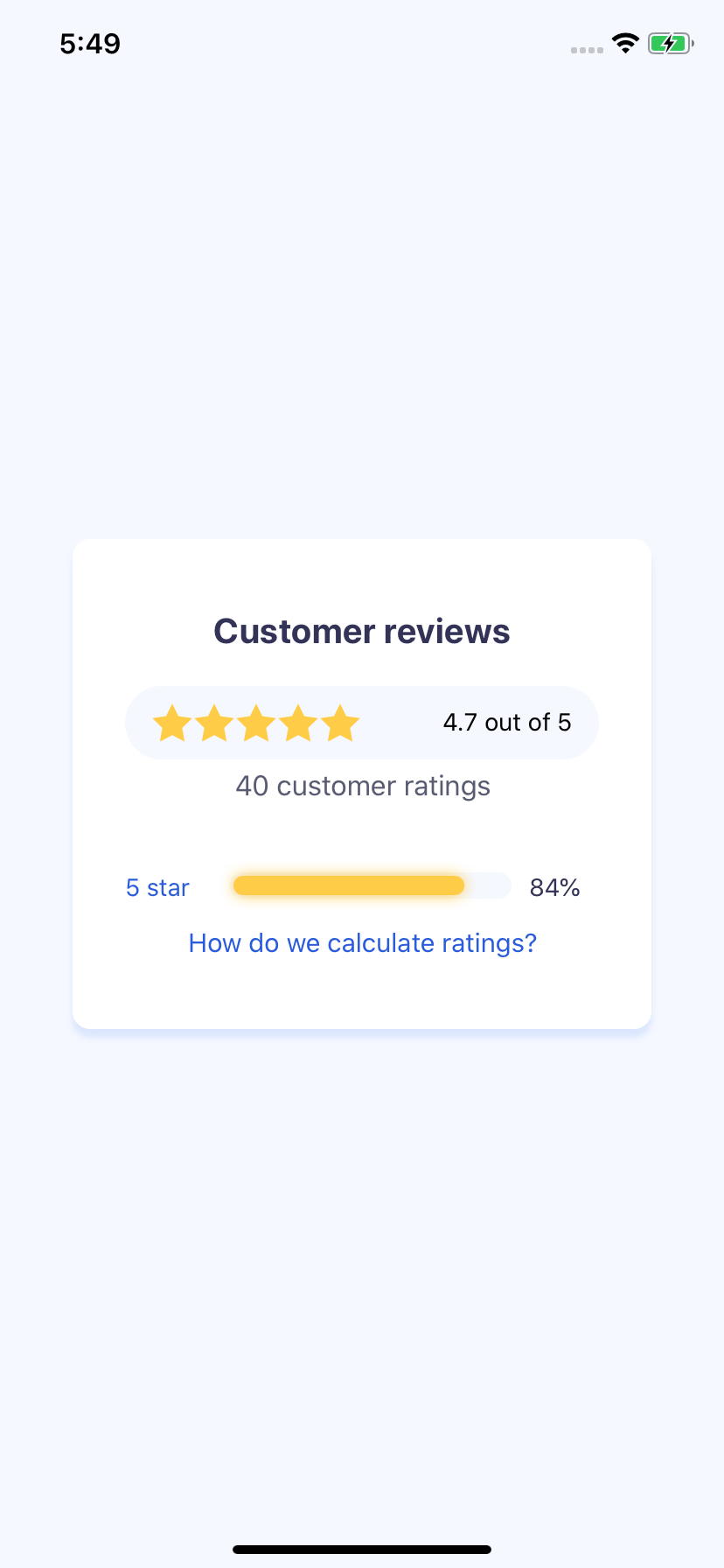
Now that we have our individual bar setup, we can reuse it for multiple bars. We just supply the star text as well as the percentage out of 100.
<View style={{ marginTop: 40 }}>
  <View style={styles.spacer}>
    <PercentageBar starText="5 star" percentage={84} />
  </View>
  <View style={styles.spacer}>
    <PercentageBar starText="4 star" percentage={9} />
  </View>
  <View style={styles.spacer}>
    <PercentageBar starText="3 star" percentage={4} />
  </View>
  <View style={styles.spacer}>
    <PercentageBar starText="2 star" percentage={2} />
  </View>
  <View style={styles.spacer}>
    <PercentageBar starText="1 star" percentage={1} />
  </View>
</View>
Additionally we can add our CTA to the bottom. This would be drive some sort of popup or navigation to explain how the ratings are calculated.
<TouchableOpacity>
  <Text style={styles.howWeCalculate}>How do we calculate ratings?</Text>
</TouchableOpacity>
{
  howWeCalculate: {
    fontSize: 15,
    color: "#2A5BDA",
    textAlign: "center",
  }
}
Animations
One addition is animation of each of the bars. If we want to animate we need to start all of our animated values at 0. We use the useState hook to hold onto our animated value. Then we use the useEffect hook to trigger our animation.
Our main dependency is the percentage. It's unlikely that it would change without our component remounting but this will retrigger the animation and animate between our new values.
Our percentage is a number, which we can animate to from 0.
const [animation] = useState(new Animated.Value(0));
useEffect(() => {
  Animated.timing(animation, {
    toValue: percentage,
    duration: 500,
  }).start();
}, [percentage]);
We can take that number and use interpolate to convert a singular number into a width text percentage. With interpolate we can map 0, and 100 the number to 0% and 100% and interpolate is smart enough to the specific value. So 84 percentage will translate to 84%.
{
    width: animation.interpolate({
        inputRange: [0, 100],
        outputRange: ["0%", "100%"],
    }),
}
All together our PercentageBar with animation looks like this.
const PercentageBar = ({ starText, percentage }) => {
  const [animation] = useState(new Animated.Value(0));
  useEffect(() => {
    Animated.timing(animation, {
      toValue: percentage,
      duration: 500,
    }).start();
  }, [percentage]);

  return (
    <View
      style={{
        flexDirection: "row",
      }}
    >
      <Text style={styles.progressText}>{starText}</Text>
      <View style={styles.progressMiddle}>
        <View style={styles.progressWrap}>
          <Animated.View
            style={[
              styles.progressBar,
              {
                width: animation.interpolate({
                  inputRange: [0, 100],
                  outputRange: ["0%", "100%"],
                }),
              },
            ]}
          />
        </View>
      </View>
      <Text style={styles.progressPercentText}>{percentage}%</Text>
    </View>
  );
};
Ending
That's all. We now have a reusable component for progress bars, and can be converted to a review container for any of your React Native needs.