Dynamic Animated Notifications
Intro
Adding a system for errors, and notifications to your app is crucial. It provides valuable feedback so your users can stay informed, and take necessary actions. React Native makes it easy to build a notification view that can be dynamically sized and animate so that feedback isn't jarring.
We'll walk through the few steps to setup a notification view, animate it into view, and finally animate it out of view.
Setup
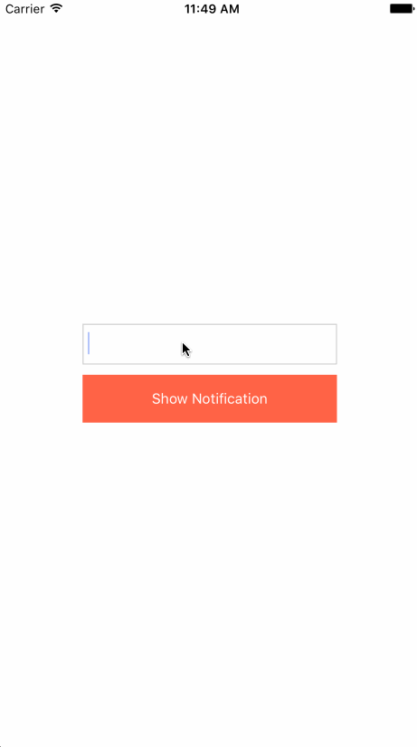
We first need to do a little setup to help us create our notification. This likely won't be in your application but for us we need a way to type in some text, and trigger it with a push of a button.
Because we need to store our text value somewhere we need to create some state.
We'll do that using the class property syntax like so. This will create our state object for this instance and create a key called value with an empty string.
export default class animated_notification extends Component {
  state = {
    value: "",
  };
}
Next up our render function.
  render() {
    return (
      <View style={styles.container}>
        <View>
          <TextInput
            style={styles.input}
            value={this.state.value}
            onChangeText={value => this.setState({ value })}
          />
          <TouchableOpacity onPress={this.handlePress}>
            <View style={styles.button}>
              <Text style={styles.buttonText}>Show Notification</Text>
            </View>
          </TouchableOpacity>
        </View>
      </View>
    );
  }
Here we've setup a simple container that centers everything (we'll get to styling in a second). Inside of our container we have a wrapping View around 2 other components.
The first is our TextInput. This will be where we type in our notification. We pass in our this.state.value that we setup up above. Then use the onChangeText callback to update our value on state. This is a standard technique to have a controlled input in React. Anytime the state changes the TextInput will update it's value.
Finally we have our TouchableOpacity. This provides us an onPress callback to trigger our notification to show. We add a wrapping View and some Text so we can style our button.
It calls our handlePress function that is also utilizing class property syntax. This allows us to bind our function to the component instance automatically.
handlePress = () => {};
Now our styling. Here is our initial styling.
container takes up the entire screen with the flex: 1 and centers our items horizontal and vertically.
button is our inner button view, we just add some padding, a background color, and margin to have some separation between our input.
buttonText changes our text to white, and centers the text in the middle of our button.
input We setup up some basic dimensions (width/height), some padding which will indent our text, and finally add a light border.
const styles = StyleSheet.create({
  container: {
    flex: 1,
    alignItems: "center",
    justifyContent: "center",
  },
  button: {
    backgroundColor: "tomato",
    padding: 15,
    marginTop: 10,
  },
  buttonText: {
    color: "#FFF",
    textAlign: "center",
  },
  input: {
    width: 250,
    height: 40,
    padding: 5,
    borderWidth: 1,
    borderColor: "#CCC",
  },
});
Our entire default setup looks like this.
export default class animated_notification extends Component {
  state = {
    value: "",
  };
  handlePress = () => {};
  render() {
    return (
      <View style={styles.container}>
        <View>
          <TextInput
            style={styles.input}
            value={this.state.value}
            onChangeText={(value) => this.setState({ value })}
          />
          <TouchableOpacity onPress={this.handlePress}>
            <View style={styles.button}>
              <Text style={styles.buttonText}>Show Notification</Text>
            </View>
          </TouchableOpacity>
        </View>
      </View>
    );
  }
}

const styles = StyleSheet.create({
  container: {
    flex: 1,
    alignItems: "center",
    justifyContent: "center",
  },
  button: {
    backgroundColor: "tomato",
    padding: 15,
    marginTop: 10,
  },
  buttonText: {
    color: "#FFF",
    textAlign: "center",
  },
  input: {
    width: 250,
    height: 40,
    padding: 5,
    borderWidth: 1,
    borderColor: "#CCC",
  },
});

Setup Notification
We need to setup another state variable to hold onto our notification text and clear our value. So lets edit our state to look like
state = {
  value: "",
  notification: "",
};
Next we need to change over our handlePress to clear our value and place it onto our new notification state.
handlePress = () => {
  this.setState({
    value: "",
    notification: this.state.value,
  });
};
Now it's time to craft what our notification looks like. We'll be animating the notification which means we need to use an Animated.View and not just a regular View.
We setup a ref <Animated.View ref={notification => (this._notification = notification)}> because we need to use the measure function on the ref eventually so we can actually craft a dynamic animation based upon the height of the of notification.
This will allow us to make a flexible notification component rather than specifying a specific height.
The final piece is the text that will render our this.state.notification.
<View style={styles.container}>
  <Animated.View
    style={[styles.notification]}
    ref={(notification) => (this._notification = notification)}
  >
    <Text style={styles.notificationText}>{this.state.notification}</Text>
  </Animated.View>
  // TextInput and button code
</View>
We need to add our notification and notificationText style.
notification: {
    position: "absolute",
    paddingHorizontal: 7,
    paddingVertical: 15,
    left: 0,
    top: 0,
    right: 0,
    backgroundColor: "tomato",
  },
  notificationText: {
    color: "#FFF",
  },
The notificationText is merely adding a white color.
The notification is what will position and style our notification. We use position: "absolute" so our notification won't be effected by our container styling. We add some padding so our internal notification text isn't right on the edge of our screen.
Finally we use left: 0, right: 0, top: 0 to position the view at the top and across the screen. This will size the notification view to the edges of it's parent container. In our case the parent container is the container view which takes up the entire screen. So our notification view will stretch across the screen.

Hide To Start
We want the notification to start off hidden and animate visible. Which means we need to setup an animated value to control the opacity of our notification view. We can add this to our state.
state = {
  value: "",
  notification: "",
  opacity: new Animated.Value(0),
};
Then we need to setup a dynamic style to apply to our Animated.View. We will do this at the top of our render function
render() {
  const notificationStyle = {
    opacity: this.state.opacity,
  };
}
Then pass it in to our Animated.View using the array style notation. This allows us to apply multiple styles to a view.
<Animated.View style={[styles.notification, notificationStyle]}>
Dynamic Measurement
When you get access to a ref on a View it has a few helpful functions. One such is the measure function. We needed to be sure to call getNode on our ref. Animated.View wraps a regular View and exposes the getNode function to get access to the internal View which has our measure function we need.
Our goal is to get the dynamic height of our view.
this.setState(
  {
    value: "",
    notification: this.state.value,
  },
  () => {
    this._notification
      .getNode()
      .measure((x, y, width, height, pageX, pageY) => {});
  }
);
The syntax here may look odd. What is happening is we are calling setState. The second function we pass to setState is equivalent to componentDidUpdate. What this means is that the notification text has officially been rendered and updated. That means when we measure the notification view it will return accurate values.
The measure returns 6 different arguments, however the one we only care about is height.
Animate In
We need to control the offset of our notification view. This will always be set to the height of the view right before we animate it.
So we'll mutate our state to look like
state = {
  value: "",
  notification: "",
  opacity: new Animated.Value(0),
  offset: new Animated.Value(0),
};
Our handlePress will now be setup to animate our notification in.
Once we have our height measurement of our notification we need to set it as a negative offset. We can do that using the setValue property on our offset.
this.state.offset.setValue(height * -1);
Once we have done that we can do a parallel animation using Animated.parallel. This will allow us to do multiple animations at once. For us that means animating in our opacity and our offset.
Animated.parallel([
  Animated.timing(this.state.opacity, {
    toValue: 1,
    duration: 300,
  }),
  Animated.timing(this.state.offset, {
    toValue: 0,
    duration: 300,
  }),
]).start();
You can see here the Animated.parallel takes an array of animations. Our first will use Animated.timing to animate our opacity to 1. It's starting value was set to 0 in our state opacity: new Animated.Value(0),. When opacity is 0 the view isn't visible.
The next is animating our offset to 0 as well. We'll explore why below.
Finally we need to setup our notificationStyle to transform our view so it responds to the offset animation we have.
const notificationStyle = {
  opacity: this.state.opacity,
  transform: [
    {
      translateY: this.state.offset,
    },
  ],
};
When we set the offset animation to -height this will move the view on the Y axis negatively. Meaning it'll move it up the screen for the amount we've set. So in this case it will move it to the exact height of the view so it won't be visible. This will make our notification look like it's sliding in from off screen.
With our offset originally set at 0, this makes the notification visibly in it's original position. This is why we our doing the Animated.timing animation to 0.

Animate Out
The final step is to animate the notification away. The concept would be to do the reverse of the animation in.
Animated.parallel([
  Animated.timing(this.state.opacity, {
    toValue: 0,
    duration: 300,
  }),
  Animated.timing(this.state.offset, {
    toValue: height * -1,
    duration: 300,
  }),
]);
We animate in parallel again, this time we animate our opacity back to 0 and animate the offset back to the -height of our notification. This will make it look like it is fading and moving off the screen at the same time.
We want these 2 animations to happen in sequence, so we will need to use the Animated.sequence command to combine them. Additionally so our user can see the notification we'll use Animated.delay to wait before moving on to the hide animation.
The Animated.sequence will execute each animation in order. Once the animation is complete it will move onto the next animation.
So in our code below.
- We animate our notification into view using
Animated.parallelto execute 2 animations at the same time. - We wait 1.5s
- We do the reverse of our first animation and execute our 2 reverse animations at the same time.
Animated.sequence([
  Animated.parallel([
    Animated.timing(this.state.opacity, {
      toValue: 1,
      duration: 300,
    }),
    Animated.timing(this.state.offset, {
      toValue: 0,
      duration: 300,
    }),
  ]),

  Animated.delay(1500),

  Animated.parallel([
    Animated.timing(this.state.opacity, {
      toValue: 0,
      duration: 300,
    }),
    Animated.timing(this.state.offset, {
      toValue: height * -1,
      duration: 300,
    }),
  ]),
]).start();
It's crucial that you call start() here otherwise nothing will animate.
Our entire handlePress code looks like this.
handlePress = () => {
  this.setState(
    {
      value: "",
      notification: this.state.value,
    },
    () => {
      this._notification
        .getNode()
        .measure((x, y, width, height, pageX, pageY) => {
          this.state.offset.setValue(height * -1);

          Animated.sequence([
            Animated.parallel([
              Animated.timing(this.state.opacity, {
                toValue: 1,
                duration: 300,
              }),
              Animated.timing(this.state.offset, {
                toValue: 0,
                duration: 300,
              }),
            ]),

            Animated.delay(1500),

            Animated.parallel([
              Animated.timing(this.state.opacity, {
                toValue: 0,
                duration: 300,
              }),
              Animated.timing(this.state.offset, {
                toValue: height * -1,
                duration: 300,
              }),
            ]),
          ]).start();
        });
    }
  );
};
Final
These techniques can be applied to many different types of views and situations. So explore on your own and see what you can build.
If you switched the height to use the width you could create a toast like animation notification system where the notification slides in from the left, or right.
Additionally if you were to switch over the positioning of the notification to be bottom: 0 you could have the notification slide in from the bottom.